Progress bars and activity indicators is something we tend to use a lot in iOS applications and it is nice to customise them instead of using all the time the standard UIActivityIndicatorView.
I think SwiftUI makes it really easy to build this kind of views and I implemented 4 of them in my sample GitHub project you can find here
Intro
I used a timer to mock the progress of an activity, you can see the implementation here
struct ContentView: View {

    @State var progressBarValue:CGFloat = 0

    var body: some View {
        VStack {
            ProgressBar(value: $progressBarValue)
            CircularProgressBar(value: $progressBarValue)
            CircularActivityIndicatory()
            KnightRider()
        }.onAppear {
            Timer.scheduledTimer(withTimeInterval: 0.5, repeats: true) { timer in
                self.progressBarValue += 0.1
                if (self.progressBarValue >= 0.9) {
                    timer.invalidate()
                }
            }
        }
    }
}
The value I set goes from 0 to 1 and is then converted in percentage to be written on a Text label. When I reach 1 I can invalidate the timer so the progress bars stop animating, while the activity indicators don’t have a value bound and continue their animation forever.
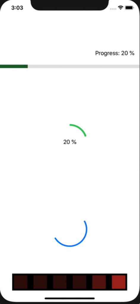
Simple progress bar
Let’s start with a simple progress bar, a line going from left to right with a label on the top right corner displaying the progress value. The code for this view can be found here
struct ProgressBar: View {
    @Binding var value:CGFloat
    ...
}
First note I use @Binding as I have a CGFloat value that is managed externally, not by this View. In our example is ContentView that increments value, and each View with a @Binding to that variable will be updated automatically.
func getProgressBarWidth(geometry:GeometryProxy) -> CGFloat {
        let frame = geometry.frame(in: .global)
        return frame.size.width * value
    }

    func getPercentage(_ value:CGFloat) -> String {
        let intValue = Int(ceil(value * 100))
        return "\(intValue) %"
    }
Those are a couple of utility functions, one to compute the width of the green line every time the progress value changes, the other one printing the values as a percentage going from 0 to 100%.
Now let’s see the view’s body
var body: some View {
    GeometryReader { geometry in
        VStack(alignment: .trailing) {
            Text("Progress: \(self.getPercentage(self.value))")
                .padding()
            ZStack(alignment: .leading) {
                Rectangle()
                    .opacity(0.1)
                Rectangle()
                    .frame(minWidth: 0, idealWidth:self.getProgressBarWidth(geometry: geometry),
                           maxWidth: self.getProgressBarWidth(geometry: geometry))
                    .opacity(0.5)
                    .background(Color.green)
                    .animation(.default)
            }
            .frame(height:10)
        }.frame(height:10)
    }
}
What is GeometryReader? It is a container view that provides a GeometryProxy object, so we’re able to know the size of the view as you saw previously in getProgressBarWidth. You may find some old examples using relativeWidth, but it has been deprecated and in beta 5 is no longer there, so I had to find a way to specify the width of the green bar and I had to use GeometryReader and the frame modifier on Rectangle.
The progress bar consist of a label and a couple of rectangles, one with a grey background and on top of that a green rectangle, which size is computed as a function of the progress value.
VStack allows us to have one view above another (in this case is Text above the rectangles) while ZStack puts the views on top of each other on the Z axis, so we can have the second rectangle on top of the first one.
The first rectangle has only its, opacity set, while the second one has a green background and an animation, but most importantly it has the frame modifier set. This is my workaround to avoid using relativeWidth, I set the minWidth to be 0, and both idealWIdth and maxWidth are computed each time value changes. Using .animations allows us to have the frame property changes to be animated, so we’ll see the progress bar animate from 0 to 10%, then from 10 to 20 etc.
Circular progress bar
My second progress bar is a circle drawn clockwise from 0 to 100% with a label on the middle printing the current value. The example can be found here
var body: some View {
    ZStack {
        Circle()
            .trim(from: 0, to: value)
            .stroke(Color.green, lineWidth:5)
            .frame(width:100)
            .rotationEffect(Angle(degrees:-90))
        Text(getPercentage(value))
    }
}
I use the .trim modifier to have only a part of the circle drawn, and I don’t need to transform value as trim expect a number from 0 to 1. Stroke sets the color and width of the line, and frame is basically the diameter of the circle. I had to use rotationEffect to have the first dot of the circle to be drawn on the very top.
That’s it, super simple and nice to see in my opinion.
Circular activity indicator
The activity indicator works similarly to the circular progress bar, but we need to keep spinning the circle until the view is removed from screen so we have to change something, see the full code here
@State var spinCircle = false

var body: some View {
    ZStack {
        Circle()
            .trim(from: 0.5, to: 1)
            .stroke(Color.blue, lineWidth:4)
            .frame(width:100)
            .rotationEffect(.degrees(spinCircle ? 0 : -360), anchor: .center)
            .animation(Animation.linear(duration: 1).repeatForever(autoreverses: false))
    }
    .onAppear {
        self.spinCircle = true
    }
}
Since there isn’t a progress value I used a Bool to start the animation. As you can see I trim half of the circle this time, so we only have an half of it spinning. On rotationEffect I had to put a condition in order to have the animation, so I go from 0 to -360, it is important to use the – sign in order to have the animation clockwise. Note that this time the animation has the repeatForever modifier, with autoreverses set to false. If you leave it to true the circle will complete a spin then go back anticlockwise, then again clockwise and so on.
Knight Rider
Some of you may not remember Knight Rirder or haven’t watched it at all, but it was quite popular when I was a kid and I loved KITT and the animation of the car. I tried to replicate it as an activity indicator just for fun and I’m quite happy with it, see here the full implementation.
struct KnightRiderRect: View {

    var index:Int
    var publisher:PassthroughSubject<AnimationStatus, Never>

    @State private var animate = false

    var body: some View {
        Rectangle()
            .foregroundColor(Color.red)
            .opacity(animate ? 1 : 0.2)
            .frame(width:40, height:40)
            .padding(.all, 5)
            .animation(Animation.linear(duration: 0.3))
            .onReceive(publisher) { value in
                switch value {
                case .start(let index):
                    if index == self.index {
                        self.animate = true
                    }
                    else {
                        self.animate = false
                    }
                case .stop(let index):
                    if index == self.index {
                        self.animate = false
                    }
                case .stopAll:
                    self.animate = false
                }

            }
    }
}
First I implemented a struct for a single rectangle. Each view has its own index, so I can start and stop animating it programmatically via a publisher, the PassthroughSubject passed as a parameter. The animation changes the opacity from 0.2 to 1, so if I start the animation I get a red dot, otherwise it turns darker. To turn on a single rectangle I can publish a new value to start the animation, and only the rectangle with the specified index will start the animation to get red, otherwise it will turn itself dark, still with animation.
struct KnightRider: View {

    @State private var increment = true
    @State private var currentIndex = 0
    @State private var publisher = PassthroughSubject<AnimationStatus, Never>()

    var body: some View {
        HStack {
            KnightRiderRect(index:0, publisher:publisher)
            KnightRiderRect(index:1, publisher:publisher)
            KnightRiderRect(index:2, publisher:publisher)
            KnightRiderRect(index:3, publisher:publisher)
            KnightRiderRect(index:4, publisher:publisher)
            KnightRiderRect(index:5, publisher:publisher)
        }
        .background(Color.black)
        .onAppear {
            Timer.scheduledTimer(withTimeInterval: 0.15, repeats: true) { timer in
                if self.increment {
                    if self.currentIndex > 5 {
                        self.increment = false
                        self.currentIndex = 5
                        self.publisher.send(.stopAll)
                    }
                    else {
                        self.publisher.send(.start(index: self.currentIndex))
                        self.currentIndex += 1
                    }
                }
                else {
                    if self.currentIndex < 0 {
                        self.increment = true
                        self.currentIndex = 0
                        self.publisher.send(.stopAll)
                    }
                    else {
                        self.publisher.send(.start(index: self.currentIndex))
                        self.currentIndex -= 1
                    }
                }
            }
        }
    }
}
The increment variable is necessary to know if I have to turn on the dots from left to right or vice versa. When I reach the end I switch the increment value and start decrementing or incrementing the currentIndex variable.
This way I’m able from a container view to control animations on child views. What do you think of the implementation? Let me know, and feel free to use the views in your projects. Happy coding!