This article is about one of welcome additions to SwiftUI in 2020: LazyVGrid and LazyHGrid. As the name suggest, you can compose vertical and horizontal grid layout in a lazy way with those views. If you’re interested in lazy layout, check out my previous article on the topic.
The sample project
In this article I’ll show you different layouts to show some beers. Why beers? Because I sometimes love to have one, and there is a web service with a list of beers with images, so I can display some data with a simple rest call. See here for more details about the API
I won’t go into details about the data source and how to load remote images, please refer to my previous article on the topic.
As usual, the code you find here is on GitHub, so let’s get started!
LazyVGrid and LazyHGrid
Before I make some examples let’s talk about the two new views, LazyVGrid for vertical layout and LazyHGrid for horizontal.
Let’s see some code
ScrollView {
    var columns:[GridItem] = [GridItem(.fixed(100), spacing: 10)]

    LazyVGrid(
        columns: columns3Fixed,
        alignment: .center,
        spacing: 10,
        pinnedViews: []
    ) {
        ForEach(model.beers) { beer in
            BeerView(beer: beer)
        }
    }
}
This example is for LazyVGrid but the horizontal version is pretty similar. As you can see, we have some parameters: columns is an array of GridItem elements, then we have the alignment for the views (horizontal or vertical depending on the Grid you chose), the spacing between them and the ability to specify an array of pinned views, useful when you have a Section with header and footer and wish to have those views always visible while scrolling.
GridItem is a description of a row or a column, depending on the type of grid you chose. There are 3 types of items: fixed, flexible and adaptive. We’ll explore those 3 types in the examples later on, for now let’s say you have to specify an array of GridItem into the call, for the columns parameter (LazyVGrid) or rows (LazyHGrid).
Columns layout
Fixed
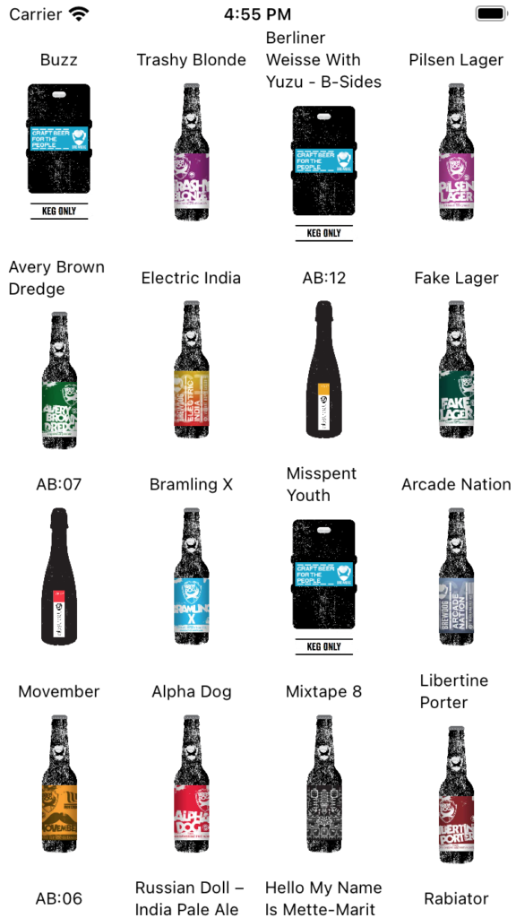
For the first example, let’s build a 3 columns layout.

The code I posted previously doesn’t change, except for the array of GridItem we pass to the LazyVGrid, so for each example I’ll only show you the array
var columns3Fixed: [GridItem] = [
    GridItem(.fixed(100), spacing: 10),
    GridItem(.fixed(100), spacing: 10),
    GridItem(.fixed(100), spacing: 10)
]
This is the simpler example, we define 3 columns of fixed length of 100, and each row inside the column has a vertical spacing of 10.
Let’s now experiment with flexible GridItems.
Flexible

This is still a 3 column layout, but this time the first one is flexible
var columns3Flexible: [GridItem] = [
    GridItem(.flexible(minimum: 50, maximum: 150), spacing: 10),
    GridItem(.fixed(80), spacing: 10),
    GridItem(.fixed(80), spacing: 10)
]
The flexible type has a minim and maximum value. Since the two following columns are of fixed size, and there is space available, the computed value is 150. If we change the second and third column with a bigger fixed value, flexible will pick a smaller value, down to a minimum of 50.

This is what happens if I set 140 instead of 80 for the fixed value. The first column, configured as flexible, shrinks down.
Adaptive
Just like flexible, adaptive has a minimum and maximum value. The layout though is completely different.

Above, you can see a 3 columns layout. But take a look at the array
var column3Adaptive: [GridItem] = [
GridItem(.adaptive(minimum: 90, maximum: 110), spacing: 10),
GridItem(.fixed(150), spacing: 10)
]
This time, I only specified 2 GridItem. The first one is adaptive, so it will try to make as many columns as possible given the constraints of minimum and maximum size.
By putting a flexible GridItem, I’d have only 2 columns, with the first one taking all the available space up to the maximum, while using adaptive I can fit more content based on the space available. Let’s see what happens if I only use one adaptive GridItem
This time we have 4 columns
var column4Adaptive: [GridItem] = [
    GridItem(.adaptive(minimum: 80, maximum: 150), spacing: 10)
]
There is only one GridItem and it is adaptive, so it will try to fit as many columns as possible and with a minimum width of 80 there is room for 4 of them. Try changing the value to flexible, you’ll see a single column 150 wide.
Rows layout
As you can imagine, fixed, flexible and adaptive work in a similar way for a layout with rows if you use LazyHGrid.
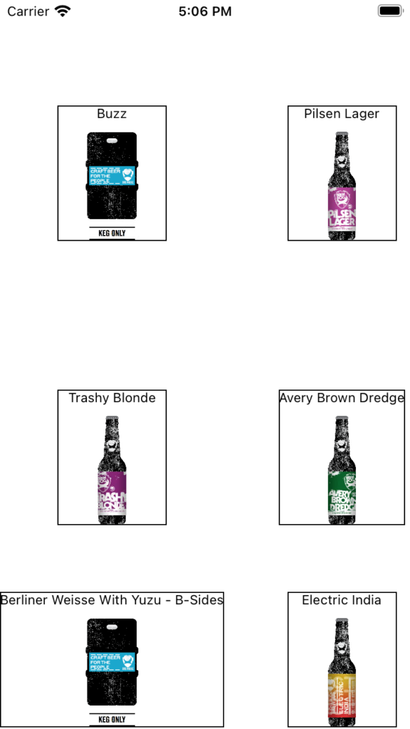
I’ll post the entire view this time instead of the array of rows only
var rows: [GridItem] = [
    GridItem(.adaptive(minimum: 200, maximum: 250), spacing: 10),
    GridItem(.fixed(100), spacing: 10)
]

ScrollView(.horizontal) {
        LazyHGrid(rows: rows, alignment: .center, spacing: 50, pinnedViews:[]
        ) {
            ForEach(model.beers) { beer in
                BeerView(beer: beer).border(Color.black)
            }
        }
    }
First, notice I embedded the Grid in a ScrollView, but this time I needed to specify the horizontal direction, since the layout is growing horizontally and not vertically.
The second thing to notice is the .border modifier on the BeerView, that allows me to see the border of the view, useful while debugging.
As I used an adaptive GridItem for the first element of the rows array, we have 2 rows, and a third one relative to the fixed GridItem.
Conclusion
This was just an example, but as you saw by only changing the array of GridItem you can completely redesign your layout. The live preview in Xcode is very handy, as you can immediately see the result of your changes and keep trying various layouts until you find the best fit.
Remember you can only target iOS 14 if you want to use LazyVGrid and LazyHGrid.
Happy coding 🙂